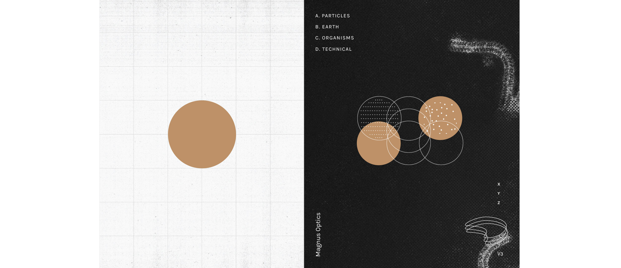

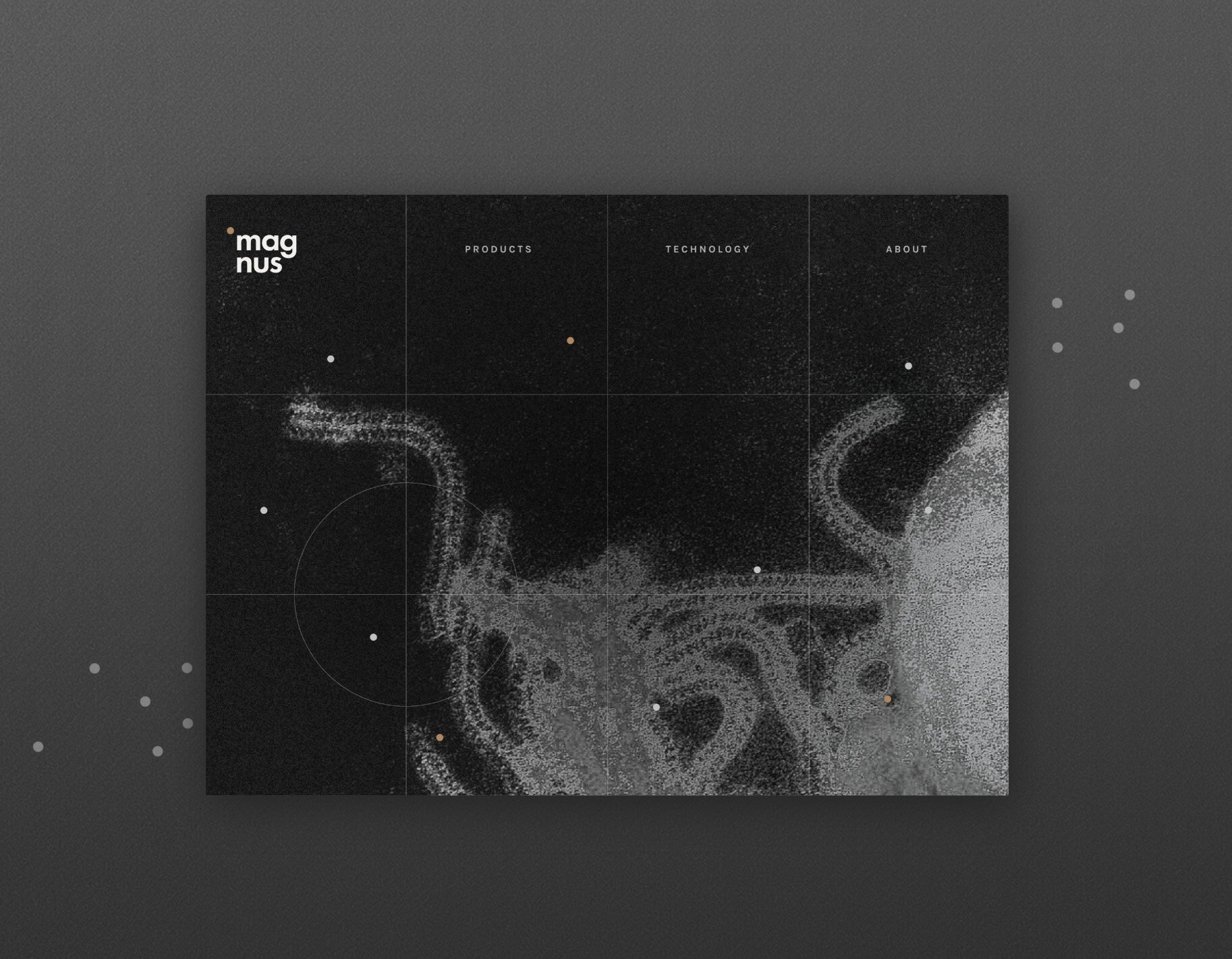


Magnus is an optics company with its conception dating back to 1938. The visual identity sums up every particle you see under a microscope under one single symbol – the circle. This has been carried forward to create symbolic representations of how particles move. The colour scheme ties technology back with nature, using earthy hues and keeping the identity humble yet modern. The illustrations are inspired from logs kept by the staff at Magnus and the visuals are microscopic/magnified organisms from our daily life.
__
Print, Web, Product