
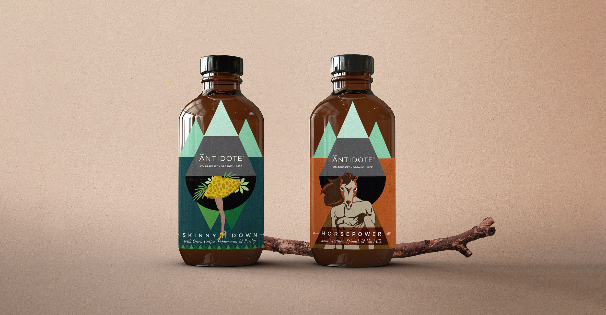

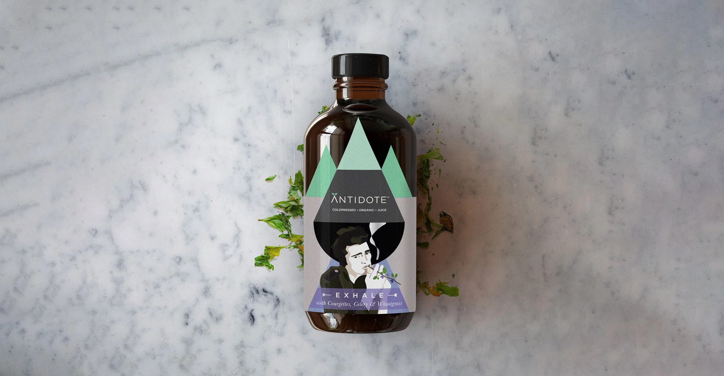


A ‘cure’ for unhealthy lifestyle, Antidote’s ingredients have been picked with the level of care that warrants a precise, geometric approach for its visual identity. The geometric drop has been broken down to create an iconic framework where intricate illustrations and information are nestled to bring its packaging together in a unique and memorable way.
__
Packaging, Print, Identity
The five cleanses inspire five illustrations.
Skinny down, Horsepower, Nine Lives, Exhale & Light Up
The medicinal amber bottles are environment friendly and add to the overall positioning of the brand.
Glug guides are mini booklets that give detailed specs on ingredients, usage, and effects.
Clients – Nadia Bahl & Carol Singh
Concept, Design, Brand – Sargam Gupta