Yolobus
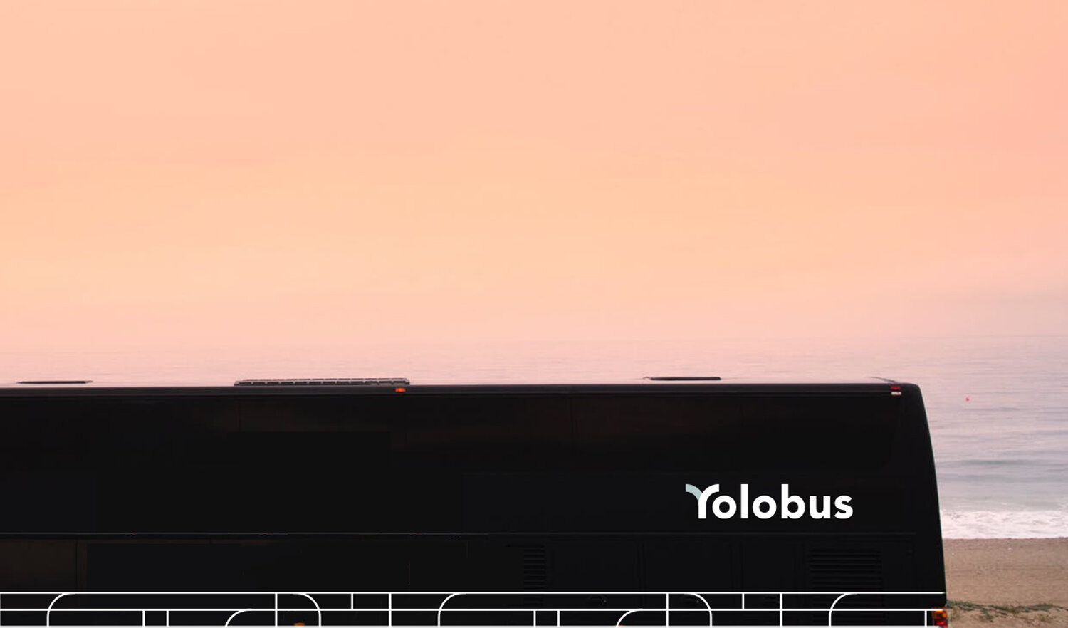
For years, there have been negative associations with bus travel. Yolobus aims to break these associations by providing travellers a safe timely and comfortable experience. This brand concept is inspired by hospitality rather than transport and the simple joys of travel. It focuses on a route not yet taken before: A brand that puts the comfort of its riders above all.

The logo type for Yolobus is simple and durable. Something that will stand the test of time. The “Y” is created by hand, showing a conjunction of paths and inspired by existing transport systems. It is also detachable as a monogram that can be used on different marketing collaterals, uniforms, in signage, and so on.


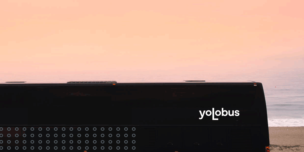
The bus branding uses a bold, yet simple design with a premium look. There is an abstract pattern that has been created using tech and bus routes as an inspiration.

While the main colour palette is black, white and grey, there are two additional colours that can be used on various extensions of the brand. They are muted and earthy to reflect the authenticity and premium feel of the brand.





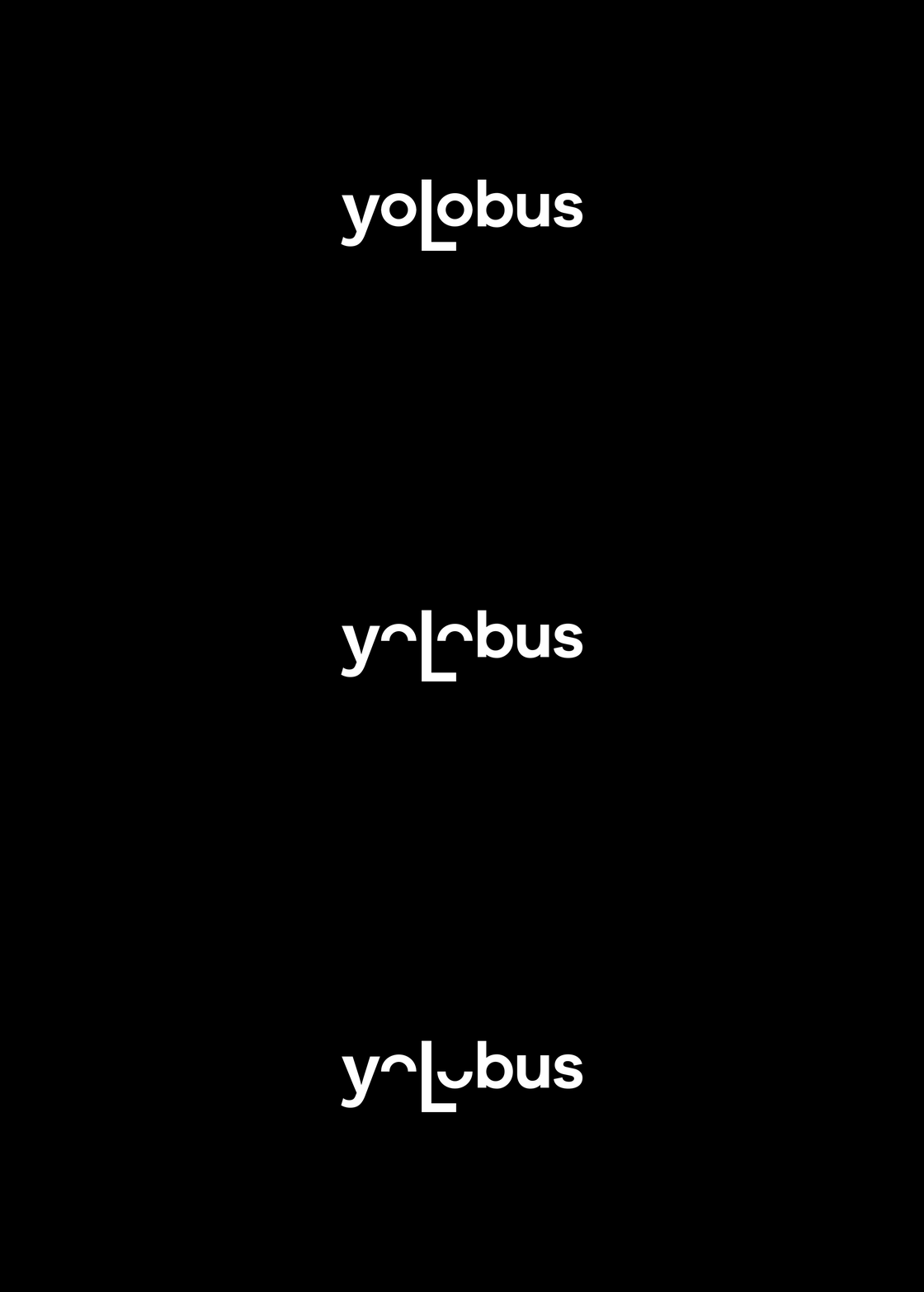
A more playful approach to the logo, this is an alternate version of the logo, which emphasises on transforming the letters in yolobus into an expression.


Thank you