
Earth + Science
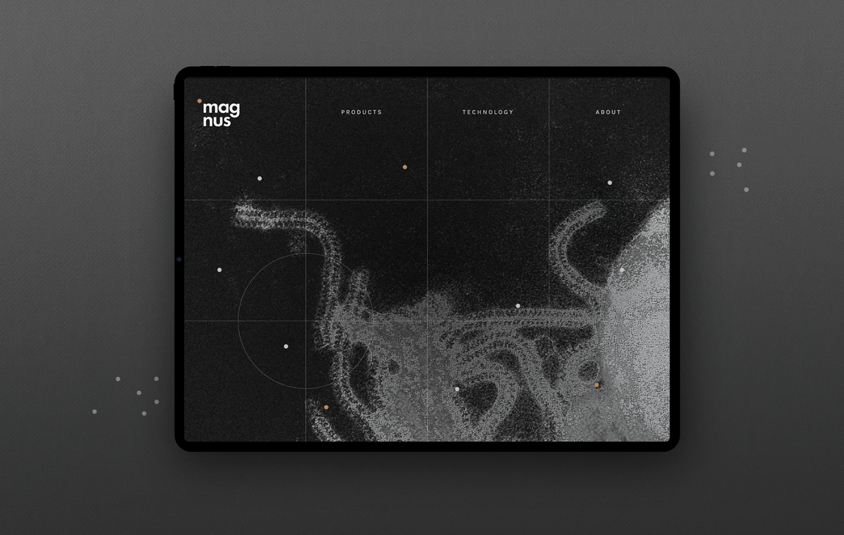
Magnus Optics is a microscope and optics company with its beginnings dating back to 1938. The visual identity sums up every particle you see under a microscope under one single symbol. The circle. This has been carried forward to create symbolic representations of how particles move. The colour scheme ties back technology with earth, keeping the identity humble, yet modern in its simplicity. The illustrations are inspired from logs kept by the staff at Magnus and the visuals are microscopic/magnified organisms from our daily life.


Interface design
The web architecture has been kept minimal to allow for quick browsing through, with a plan to add more layers and information post user testing. The idea is to present Magnus as a company that takes its work seriously, but is also playful and modern. This has been brought across in simple animations and photography style.


